Adding Interactive Elements: Sliders - SOLVED
Contents
Adding Interactive Elements: Sliders - SOLVED#
In order to obtain some interactive features we have to import the following library:
from ipywidgets import interact, interactive, fixed
import matplotlib.pyplot as plt
import numpy as np
Let’s define some function of two variables, and a value c that is fixed.
def g(x, y, c):
    return x**2+y**2 + c

g(4,5,6)
47
To interact with our values of x and y to change the output of \(g(x,y)\), we can make use of sliders:
interact(g, x=(0,10), y=(-10, 0), c=fixed(5))
<function __main__.g(x, y, c)>
Now you can use the sliders above to check different values of \(g\) for different inputs \(x\) and \(y\).
You could also have input an array of values for \(c\) as follows:
import numpy as np
cvals = np.linspace(1,5,5)
interact(g, x=(0,10), y=(-10, 0), c=fixed(cvals))
<function __main__.g(x, y, c)>
Suppose we want non-integer changes for our slider-generated values of \(x\) and \(y\). This can be dones as follows:
x = np.linspace(1,5,5)
interact(g, x=(0,10,0.5), y=(-10, 0, 0.5), c=fixed(x))
<function __main__.g(x, y, c)>
Exercise 4.1#
Let’s make a plot of the function \( x(t) = \sin{(\omega t - \phi)} \), using sliders to control the values of \(\omega\) and \(\phi\):
Create an array of \(t\) values between 0 and \(5\pi\).
Add sliders called
omegaandphito control the values of \(\omega\) and \(\phi\).Complete the function
func_tto calculate \(x(t)\), using \(t\), \(\omega\) and \(\phi\) as inputs.Modify the command for the plot of \(x(t)\) versus \(t\) to add appropriate labels to your plot.
import numpy as np
import matplotlib.pyplot as plt
from ipywidgets import interact, interactive, fixed


def func_t(omega,phi,t):
  #Modify this to calculte x(t)
  xt = np.sin(omega*t - phi)
  #make the plot below look nicer
  plt.clf()
  plt.plot(t,xt)
  plt.xlabel("t")
  plt.ylabel("x(t)")
  return xt


#Add the rest of the code to make the sliders here
interact(func_t, omega=(0,10), phi=(-10, 0), t=fixed(np.linspace(0,5*np.pi,200)))
<function __main__.func_t(omega, phi, t)>
Adding error bars#
When performing an experiment, any measurements will have a degree of uncertainty. We represent this uncertainty on plots using error bars.
In this example we will go over plotting uncertainties in various ways:
y errorbars
x errorbars
x and y errorbars
We can plot errorbars on our data as follows:
ax.errorbar(x,y,xerr=A,yerr=B)
An excellent demo of errorbar plotting can be found in the matplotlib gallery: https://matplotlib.org/examples/statistics/errorbar_demo_features.html
If your data has asymmetric errorbars, documentation on this can be found at: https://matplotlib.org/examples/statistics/errorbar_demo_features.html
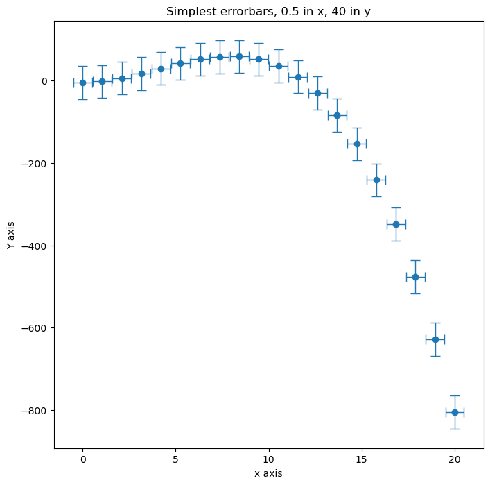
For example, for fixed size errorbars (each data point has the same error)
#generate some data to plot.
x = np.linspace(0.,20.,20)
y = (3*x**2) - (0.25*x**3) - 5.

fig = plt.figure(figsize=(8,8))
ax = fig.add_subplot(111)
#ax.scatter(x,y)

#Add error bars
ax.errorbar(x, y, xerr=0.5, yerr=40, fmt='o', capsize=5, elinewidth=1)

ax.set_title("Simplest errorbars, 0.5 in x, 40 in y");
ax.set_xlabel("x axis")
ax.set_ylabel("Y axis")
plt.show()