Scatter plots- SOLVED
Contents
%matplotlib inline
import numpy as np
import matplotlib.pyplot as plt
Scatter plots- SOLVED#
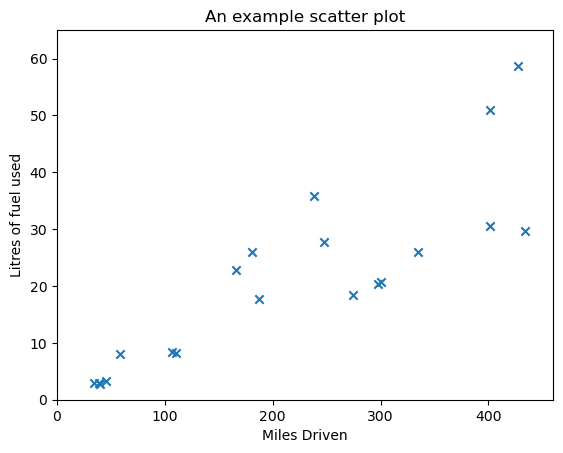
Another y-vs-x plot, which can take some additional arguments is the scatter plot. It is often most appropriate when plotting unordered data. We give a set of data below.
Exercise 2.1#
Edit the example below to add plot labels, title and adjust axes limits etc. to make the plot more presentable.
# EXERCISE DATA: run this cell to load the data

#An array of miles driven
miles_driven = np.array([434.04176413,  58.37912319, 274.49347372, 187.58345291,
                         110.44926801, 297.90761681, 427.3174571 ,  40.08715083,
                         247.86116708,  38.89521804, 300.07810287, 401.12704009,
                         106.67851003, 181.12323573, 166.38794894,  44.99799719,
                         34.51051553, 237.9278912 , 334.86250092, 401.45589443])

#A second array giving the number of litres of fuel used
litres_of_fuel_used = np.array([29.75678795,  8.03556788, 18.4741211 , 17.77530259,  8.16607936,
                                20.3677596 , 58.68917566,  2.69293311, 27.78266044,  3.00068322,
                                20.71372582, 50.88017624,  8.41255259, 25.94509149, 22.77377999,
                                3.29926235,  3.00036682, 35.79350616, 25.93291949, 30.63069581])

# Use plt.scatter? (and online help pages) to see the options that this plot can take. Use this to tweak the plot
# after creating it if you want to make it nicer!

plt.scatter(miles_driven, litres_of_fuel_used, marker='x')
plt.title("An example scatter plot")
plt.xlabel("Miles Driven")
plt.ylabel("Litres of fuel used")
plt.xlim((0,460))
plt.ylim((0,65))
plt.show()
# ADD CODE HERE
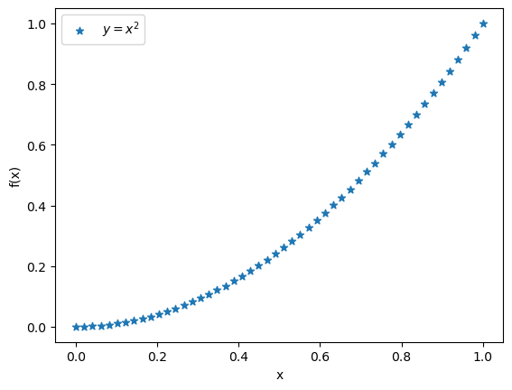
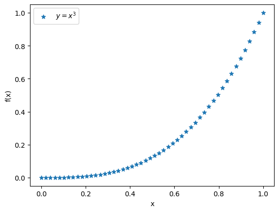
Exercise 2.2#
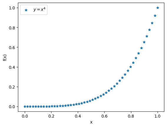
Plot the functions \(f(x) = x^2\), \(f(x) = x^3\) and \(f(x) = x^4\) datasets used above with the plt.scatter plot command over the range \(0 \leq x \leq 1\).
x = np.linspace(0,1,50)
f1 = x**2
f2 = x**3
f3 = x**4

plt.clf()
plt.scatter(x,f1,label = "$y=x^{2}$",marker="*")
plt.xlabel("x")
plt.ylabel("f(x)")
plt.legend()
plt.show()

plt.clf()
plt.scatter(x,f2,label = "$y=x^{3}$",marker="*")
plt.xlabel("x")
plt.ylabel("f(x)")
plt.legend()
plt.show()

plt.clf()
plt.scatter(x,f3,label = "$y=x^{4}$",marker="*")
plt.xlabel("x")
plt.ylabel("f(x)")
plt.legend()
plt.show()
Exercise 2.3#
We have provided two datasets below, but they are not well structured. These are a list of length-2 tuples. Each tuple contains an x and y value (x is the first element of the tuple, y the second element). Use the plotting skills and indexing skills learnt so far, plot y as a function of x. That is, x-values should be on the horizontal (x) axis, and y-values should be on the vertical (y) axies. Make sure to include a line connecting the points.
HINT: These datasets are not sorted, you will probably need to sort them before plotting to ensure that the line makes sense!
Can you identify what function each dataset represents?
data_set_one = [(11, 403.31159963300337), (6, 90.18163074019441), (7, 131.64181424216494), (13, 611.3381655534142),
                (14, 735.3648478076925), (16, 1026.0), (17, 1193.577525803504), (12, 500.8306325798367),
                (4, 34.0), (9, 245.0), (8, 183.01933598375618), (15, 873.4212528966688), (1, 3.0),
                (3, 17.588457268119896), (18, 1376.6155826266483), (0, 2.0), (2, 7.656854249492381),
                (10, 318.22776601683796), (19, 1575.562518618183), (5, 57.90169943749474)]

data_set_two = [(4.25, -1.2460874899137928), (5.5, -0.09133022570874005), (2.0, -1.2161468365471424),
                (1.5, -0.7292627983322971), (2.5, -1.6011436155469339), (2.25, -1.428173622722739),
                (0.75, -0.06831113112617915), (4.75, -0.7623978471120235), (0.5, 0.07758256189037271),
                (4.5, -1.0107957994307797), (3.0, -1.7899924966004455), (5.25, -0.28791452275815943),
                (1.25, -0.48467763760473137), (3.25, -1.7941296760805463), (1.75, -0.9782460556494921),
                (3.5, -1.7364566872907963), (1.0, -0.2596976941318603), (4.0, -1.453643620863612),
                (0.0, 0.19999999999999996), (0.25, 0.1689124217106447), (5.75, 0.061192417161520796),
                (5.0, -0.5163378145367737), (3.75, -1.6205593573395607), (2.75, -1.7243023786324636)]
#sort the datasets
#sort the datasets
#data_set_one.sort()
#d2 = np.array(data_set_two)
#data_set_two.sort()
#d1 = np.array(data_set_one)

print(data_set_two)
print(type(data_set_two))
print(type(data_set_two[1]))
[(4.25, -1.2460874899137928), (5.5, -0.09133022570874005), (2.0, -1.2161468365471424), (1.5, -0.7292627983322971), (2.5, -1.6011436155469339), (2.25, -1.428173622722739), (0.75, -0.06831113112617915), (4.75, -0.7623978471120235), (0.5, 0.07758256189037271), (4.5, -1.0107957994307797), (3.0, -1.7899924966004455), (5.25, -0.28791452275815943), (1.25, -0.48467763760473137), (3.25, -1.7941296760805463), (1.75, -0.9782460556494921), (3.5, -1.7364566872907963), (1.0, -0.2596976941318603), (4.0, -1.453643620863612), (0.0, 0.19999999999999996), (0.25, 0.1689124217106447), (5.75, 0.061192417161520796), (5.0, -0.5163378145367737), (3.75, -1.6205593573395607), (2.75, -1.7243023786324636)]
<class 'list'>
<class 'tuple'>
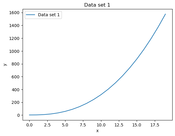
#plot data set one
data_set_one.sort()
data_set_two.sort()
d2 = np.array(data_set_two)
d1 = np.array(data_set_one)
print(d2)

plt.clf()
plt.plot(d1[:,0],d1[:,1],label="Data set 1")
plt.ylabel("y")
plt.xlabel("x")
plt.legend()
plt.title("Data set 1")

# OR (slower, but perhaps clearer)

x_vals = []
y_vals = []
for entry in data_set_one:
    x_vals.append(entry[0])
    y_vals.append(entry[1])

plt.figure()
plt.plot(x_vals,y_vals,label="Data set 1")
plt.ylabel("y")
plt.xlabel("x")
plt.legend()
plt.title("Data set 1")
[[ 0.          0.2       ]
 [ 0.25        0.16891242]
 [ 0.5         0.07758256]
 [ 0.75       -0.06831113]
 [ 1.         -0.25969769]
 [ 1.25       -0.48467764]
 [ 1.5        -0.7292628 ]
 [ 1.75       -0.97824606]
 [ 2.         -1.21614684]
 [ 2.25       -1.42817362]
 [ 2.5        -1.60114362]
 [ 2.75       -1.72430238]
 [ 3.         -1.7899925 ]
 [ 3.25       -1.79412968]
 [ 3.5        -1.73645669]
 [ 3.75       -1.62055936]
 [ 4.         -1.45364362]
 [ 4.25       -1.24608749]
 [ 4.5        -1.0107958 ]
 [ 4.75       -0.76239785]
 [ 5.         -0.51633781]
 [ 5.25       -0.28791452]
 [ 5.5        -0.09133023]
 [ 5.75        0.06119242]]
Text(0.5, 1.0, 'Data set 1')

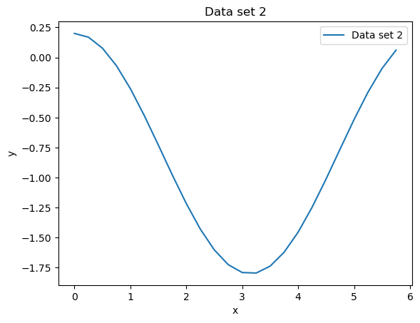
#plot data set two
plt.clf()
plt.plot(d2[:,0],d2[:,1],label="Data set 2")
plt.xlabel("x")
plt.ylabel("y")
plt.legend()
plt.title("Data set 2")
Text(0.5, 1.0, 'Data set 2')