Introduction to plotting in matplotlib - SOLVED
Contents
Introduction to plotting in matplotlib - SOLVED#
In this lecture, we’ll be making use of the matplotlib package. The matplotlib library is a powerful tool, capable of producing publication quality figures in both 2D and 3D. For more information on matplotlib, including tutorials, visit https://matplotlib.org/. A comprehensive gallery of the possible plots you can produce with matplotlib is available at https://matplotlib.org/stable/gallery/index.html.
This week, we’ll be covering the basics of creating 2D graphs and images using the matplotlib package. These skills will be crucial in presenting work to others, and will be tested in both courseworks… This also provides you a means to create any plots you might need to produce in your 3rd- or 4th-year project!
In papers/reports we commonly see presentational problems in plots/graphs such as:
font size is small
font type is ugly
tick size is small
lines are too thin
colours unsuitable for people who are colour blind
ugly legend formatting
Using matplotlib, you have complete control over all of these!
Making a basic plot in python with matplotlib#
First, we import the matplotlib core plotting library matplotlib.pyplot as follows (be sure to run this code block):
import matplotlib.pyplot as plt
import numpy as np
We’ve shortened the subpackage name matplotlib.pyplot using the shorthand plt.
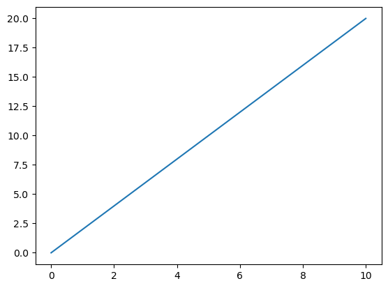
We’re also going to create some basic data using numpy, and then plot this. We will create an array of evenly numbers between 0 and 20, and check this has produced the expected numbers using the print command. I’ll then plot the result.
#%matplotlib inline
# This "Magic" line is needed to ensure that produced plots are displayed in the notebook environment
# You need to run this for the plots to display properly.
# This numpy function creates a list of 11 numbers uniformly spaced between 0 and 20. You can always do
# np.linspace? in any cell of the notebook to get a descriptive help about what any function, or method, does.
x = np.linspace(0,20,11)
print(x)

# Then we just make a basic plot of x
plt.plot(x)
# This plots the array on the y-axis.
plt.show()
[ 0. 2. 4. 6. 8. 10. 12. 14. 16. 18. 20.]
To produce a more complicated plot, we’ll construct another x-array (again using the np.linspace command), calculate their sin and tan values, and plot the result.
x = np.linspace(0,10,200)
y = np.sin(x)
z = np.tan(x)

# Now with two input arrays the first is the x axis and is plotted against the second on the y-axis
plt.plot(x,y)
plt.plot(x,z)
plt.show()
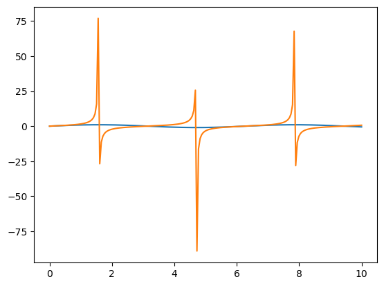
What’s wrong with this plot? What is missing? Would you be happy using this plot as is in a report?