Part 2: Making a nice-looking, well-labelled plot- SOLVED
Contents
Part 2: Making a nice-looking, well-labelled plot- SOLVED#
First, we import the matplotlib core plotting library matplotlib.pyplot as follows (be sure to run this code block):
%matplotlib inline
import matplotlib.pyplot as plt
import numpy as np
Improving our previous plot#
In the previous notebook, we produced the following plot. There are several issues: the y-axis range is too large, the axes are unlabelled, and there is no legend (key) to tell us which line represents which function. Let’s fix this.
x = np.linspace(0,10,200)
y = np.sin(x)
z = np.tan(x)

# Now with two input arrays the first is the x axis and is plotted against the second on the y-axis
plt.plot(x,y)
plt.plot(x,z)
plt.show()
Adding axis labels, titles and legends#
Let’s add some axis labels, a title, and a legend to our plot.
You can add axis label using xlabel and ylabel:
plt.xlabel("x-axis label")
plt.ylabel("y-axis label")
A title can be added using the command plt.title, and a legend with plt.legend
When a plot has multiple data sets or functions shown, a legend can be used to identify which lines or points belong to which dataset. To add a legend to our plot, we need to modify the original plot commands slightly, to include a label for the plot legend. A legend tells us the variable each marker or line represents.
plt.plot(x,y, label='sin(x)')
plt.plot(x,z, label='tan(x)')
plt.legend() #Adds the legend to the plot
Exercise 1.1#
Reproduce the plot shown above, adding the required lines, axis labels, a title and a plot legend using the new commands outlined above.
#clear the original plot
plt.clf()

#Add a title
plt.title("My pretty plot of trig functions")

#Add the axis labels.
plt.xlabel("x")
plt.ylabel("y")

#plot the functions, with legend labels

plt.plot(x,y, label='sin(x)')
plt.plot(x,z, label='tan(x)')
#add a legend
plt.legend()

plt.show()
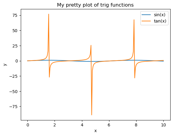
Unfortunately the range of tan(x) is much larger than sin(x) and we can’t see the latter! A grid may also help us explore the behaviour of the two functions in more detail.
We can remove some of the white space around the plot using plt.ylim:
#modify the axis limits
plt.ylim(-1.1,1.1)
plt.xlim(0.,10.)

# add a grid to improve the readability of the plot

plt.grid(alpha=0.5)
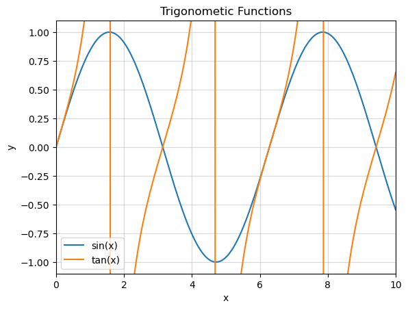
Exercise 1.2#
Remake your plot from exercise 1.1, setting the \(x\) and \(y\) axis limits to more sensible values such that the behaviour of both \(\tan{x}\) and \(\sin{x}\) can be seen. It may be useful to use the max() and min() commands to explore the behaviour of \(\sin{x}\).
#Add a title
plt.title('Trigonometic Functions')

#Add the axis labels.
plt.xlabel("x")
plt.ylabel("y")

print(max(y), min(y))

#plot the functions, with legend labels
plt.plot(x,y, label='sin(x)')
plt.plot(x,z, label='tan(x)')

#modify the axis limits
plt.ylim(-1.1,1.1)
plt.xlim(0.,10.)

#add a grid to make the plot more readable
plt.grid(alpha=0.5)

#add a legend
plt.legend()

plt.show()
0.9999154051985663 -0.9999369542060184
Line formatting#
You might want lines that are different colours to the default matplotlib colour scheme, or use a different line style. These can be adjusted by adding formatting strings to the plot command:
plot(x,y,color='cname', linestyle='lname')
Replace cname or lname with your choice of colour name or line style as outlined below.
Python understands all html colour names as input. A good reference for these can be found at this link: https://html-color-codes.info/color-names/
Be sure to use the colour name e.g. MediumPurple rather than the code.
It also understands these basic colour name commands:
r= redg= greenb= bluec= cyanm= magentay= yellowk= blackw= white
The style of the plotted lines can also be adjusted, using the following (other line options are available):
-= solid line--= dashed line:= dotted line-.= dot-dash line
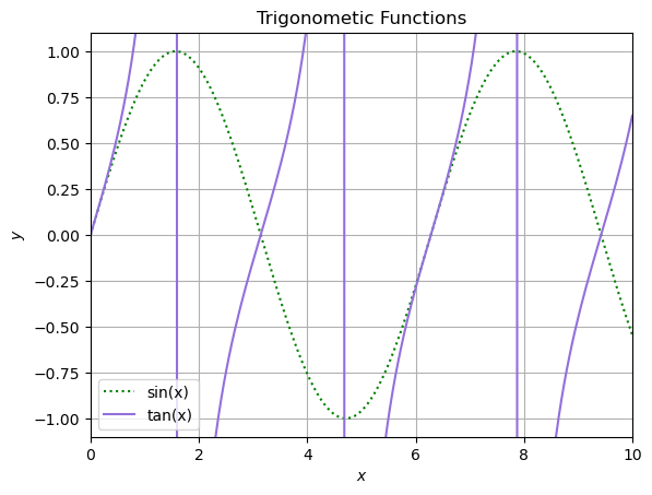
Exercise 1.3#
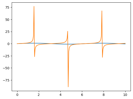
Modify the earlier plot showing the sine and tan functions as follows:
The sine function should be plotted as a green dotted line
The tan function should be plotted as a purple dashed line
You may may choose any colour names you like, provided they produce the requested plots. Be sure to restrict the limits of the plots to show a useful data range.
#Add a title
plt.title('Trigonometic Functions')

#Add the axis labels. The $$ signs are a LaTeX command, they can be omitted.
plt.xlabel("$x$")
plt.ylabel("$y$")

#plot the functions, with legend labels
plt.plot(x,y, color='g', linestyle=':', label='sin(x)')
plt.plot(x,z, color='MediumPurple', linestyle='-',  label='tan(x)')

#modify the axis limits
plt.ylim(-1.1,1.1)
plt.xlim(0.,10.)

#add a grid to make the plot more readable
plt.grid()

#add a legend
plt.legend()

plt.show()
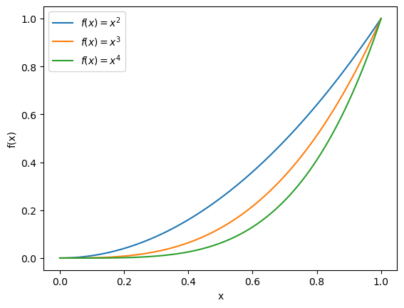
Exercise 1.4#
Using the above examples as a starting point, create a single plot containing the following:
Plot the functions \(f(x) = x^2\), \(f(x) = x^3\) and \(f(x) = x^4\) for values of \(x\) between 0 and 1 on the same set of axes. The plot must have a legend, and you should ensure that each function is described in the legend. Use enough values of \(x\) such the plot looks smooth. Hint: using commands from the \(\LaTeX\) (LaTeX) typsetting language can make your labels look really good. Try using
f'$f(x) = x^{2}$'as a label.You can create a plot with log scale axes by replacing
plt.plotwithplt.loglog. Or if you just want a log-scaled y (or x) axis, you can useplt.semilogyorplt.semilogx. Create three copies of the same plot as previously but use these 3 commands instead ofplt.plot. (Remember that you cannot take the log of 0, so consider this when choosing x and y values!)
x = np.linspace(0,1,100)
f1 = x**2
f2 = x**3
f3 = x**4

plt.clf()
plt.plot(x,f1,label = f'$f(x) = x^{2}$')
plt.plot(x,f2,label = f'$f(x) = x^{3}$')
plt.plot(x,f3,label = f'$f(x) = x^{4}$')
plt.xlabel("x")
plt.ylabel("f(x)")
plt.legend()
plt.show()
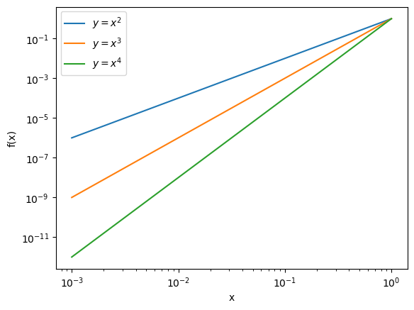
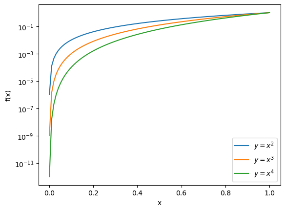
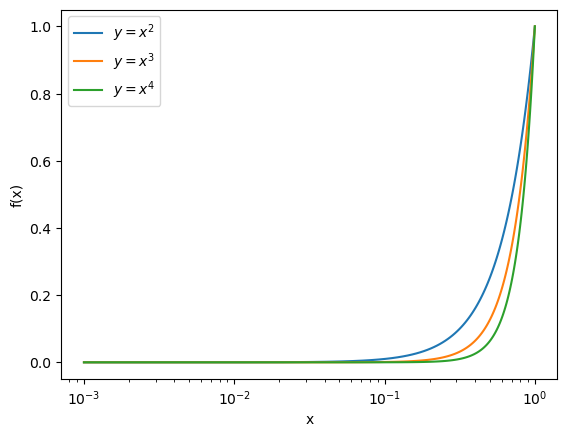
x = np.linspace(0.001,1,100)
f1 = x**2
f2 = x**3
f3 = x**4

plt.clf()
plt.loglog(x,f1,label = "$y=x^{2}$")
plt.loglog(x,f2,label = "$y=x^{3}$")
plt.loglog(x,f3,label = "$y=x^{4}$")
plt.xlabel("x")
plt.ylabel("f(x)")
plt.legend()
plt.show()

plt.clf()
plt.semilogy(x,f1,label = "$y=x^{2}$")
plt.semilogy(x,f2,label = "$y=x^{3}$")
plt.semilogy(x,f3,label = "$y=x^{4}$")
plt.xlabel("x")
plt.ylabel("f(x)")
plt.legend()
plt.show()

plt.clf()
plt.semilogx(x,f1,label = "$y=x^{2}$")
plt.semilogx(x,f2,label = "$y=x^{3}$")
plt.semilogx(x,f3,label = "$y=x^{4}$")
plt.xlabel("x")
plt.ylabel("f(x)")
plt.legend()
plt.show()