Histograms
Contents
import numpy as np
import matplotlib.pyplot as plt
Histograms#
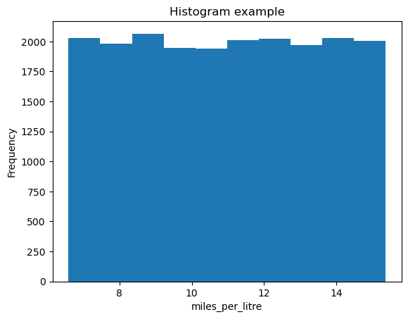
Let’s create a histogram of some data. We’ll compute the miles driven per litre of fuel, and make a histogram of the result. The histogram function is a little weird, so let’s try and illustrate this.
# Let's generate some fake data to work with.
#(don't worry yet about *how* this is generated!)
miles_driven = np.random.random(20000) * 90. + 10
litres_of_fuel_used = miles_driven / (10.977912440170378 * (np.random.random(20000) * 0.8 + 0.6))
# A basic histogram

# Compute what we want to histogram
miles_per_litre = miles_driven / litres_of_fuel_used

plt.hist(miles_per_litre)
plt.title('Histogram example')
plt.xlabel('miles_per_litre')
plt.ylabel('Frequency')
Text(0, 0.5, 'Frequency')
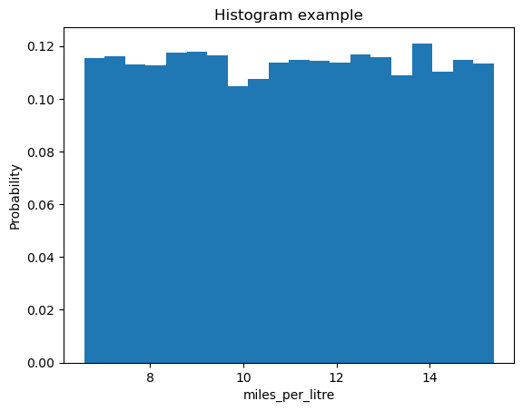
Let’s see what we can change in this histogram. Here we provide two key-word arguments to plt.hist. bins is an integer specifying the number of bins the data is split into, density can be used to normalize the plot so this becomes a probability. Using plt.hist? will tell you what these options are.
# A basic histogram again

# Compute what we want to histogram
miles_per_litre = miles_driven / litres_of_fuel_used

plt.hist(miles_per_litre, bins=20, density=True)
plt.title('Histogram example')
plt.xlabel('miles_per_litre')
plt.ylabel('Probability')
Text(0, 0.5, 'Probability')
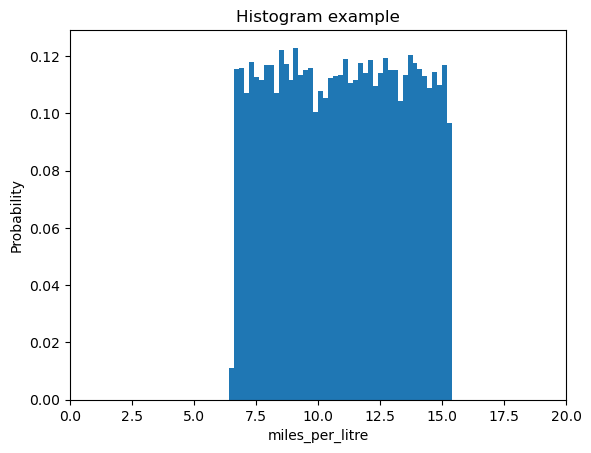
bins can also take an array of values:
# A basic histogram again

# Compute what we want to histogram
miles_per_litre = miles_driven / litres_of_fuel_used

plt.hist(miles_per_litre, bins=np.arange(5,20,0.2), density=True)
plt.title('Histogram example')
plt.xlabel('miles_per_litre')
plt.xlim(0,20)
plt.ylabel('Probability')
Text(0, 0.5, 'Probability')
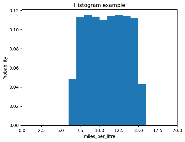
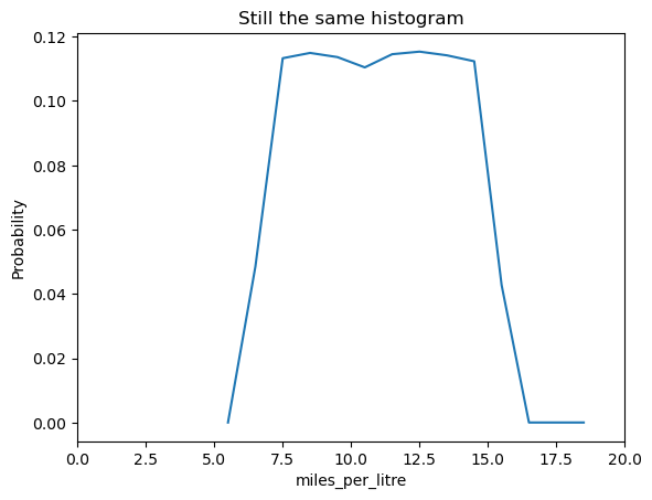
The plt.hist command also returns some useful information. It returns 3 values, n, bins and patches. We can ignore patches it’s an internal for the plotting and very rarely used. n is the probability (or frequency) of each of the bars used in the histogram, or the height of each bar. bins is the edge of each of the bars. The length of this will be one larger than n as each bar has two edges and all but the outer two are shared. If we use n and the center of each bar, we can also plot a line graph on top of this!
# A basic histogram again

# Compute what we want to histogram
miles_per_litre = miles_driven / litres_of_fuel_used

n, bins, patches = plt.hist(miles_per_litre, bins=np.arange(5,20,1), density=True)
# Want center of bins, this is done with:
bin_centers = (bins[:-1] + bins[1:]) / 2
# THINK ABOUT WHAT THE PREVIOUS LINE IS DOING, how does it work??
plt.title('Histogram example')
plt.xlabel('miles_per_litre')
plt.xlim(0,20)
plt.ylabel('Probability')

# Create a second! figure
plt.figure()
plt.plot(bin_centers, n)
plt.title('Still the same histogram')
plt.xlabel('miles_per_litre')
plt.xlim(0,20)
plt.ylabel('Probability')
plt.show()
Using histograms to explore data#
Let’s create a histogram of some exam results. In the code block below, results for two subjects are presented as a numpy array, along with student number. The first column of the array is the student identity, the second column is the result for subject 1, and the third column is the result for subject 2.
exam_results = np.array([[  1.        ,  70.73956466,  72.41314302],
       [  2.        ,  67.99148762,  78.92281229],
       [  3.        ,  63.267019  ,  73.70905389],
       [  4.        ,  80.92116686,  97.09605513],
       [  5.        ,  45.26067825,  51.29838892],
       [  6.        ,  47.82370635,  54.11048266],
       [  7.        ,  71.16827658,  80.03105428],
       [  8.        ,  69.53215499,  76.25594456],
       [  9.        ,  42.8598281 ,  62.61465786],
       [ 10.        ,  36.43916344,  45.82388885],
       [ 11.        ,  82.90174814,  84.32172436],
       [ 12.        ,  50.37521144,  65.6275095 ],
       [ 13.        ,  66.74455826,  75.83412285],
       [ 14.        ,  55.32285171,  63.10303691],
       [ 15.        ,  65.73495683,  75.81885856],
       [ 16.        ,  76.0219976 ,  85.5319897 ],
       [ 17.        ,  38.08746824,  54.64233231],
       [ 18.        ,  79.8372733 ,  93.00396844],
       [ 19.        ,  76.01442223,  96.46448714],
       [ 20.        ,  58.02985105,  64.75190419],
       [ 21.        ,  40.52704653,  60.47125425],
       [ 22.        ,  70.66882769,  84.71060747],
       [ 23.        ,  48.5342397 ,  58.02515169],
       [ 24.        ,  47.54020755,  47.62578148],
       [ 25.        ,  54.11323876,  67.97462115],
       [ 26.        ,  38.28093002,  42.79495584],
       [ 27.        ,  36.59503322,  48.69430327],
       [ 28.        ,  33.84867708,  44.43720282],
       [ 29.        ,  74.66290772,  90.18370617],
       [ 30.        ,  47.23836888,  59.73585737],
       [ 31.        ,  54.75012795,  68.87991986],
       [ 32.        ,  62.03758377,  71.84132858],
       [ 33.        ,  66.65167142,  79.90693845],
       [ 34.        ,  26.72953461,  36.69420763],
       [ 35.        ,  53.08619   ,  54.91571935],
       [ 36.        ,  47.21023846,  55.30553085],
       [ 37.        ,  66.02714831,  62.06656138],
       [ 38.        ,  75.20276983,  90.48009585],
       [ 39.        ,  63.2538258 ,  69.13807308],
       [ 40.        ,  51.56423263,  54.39883796],
       [ 41.        ,  64.91847439,  67.59731781],
       [ 42.        ,  46.95447299,  51.84797284],
       [ 43.        ,  47.77083436,  61.81327459],
       [ 44.        ,  59.69085344,  73.50586767],
       [ 45.        ,   8.17242208,  23.18407151],
       [ 46.        ,  34.62284483,  45.71480234],
       [ 47.        ,  52.8604269 ,  70.25417135],
       [ 48.        ,  51.74504612,  55.76399523],
       [ 49.        ,  54.50697994,  59.68155288],
       [ 50.        ,  82.48217025, 103.48154944],
       [ 51.        ,  60.28539761,  70.78967487],
       [ 52.        ,  58.54967699,  65.75231913],
       [ 53.        ,  77.17822098,  84.42547234],
       [ 54.        ,  78.31459855,  84.5724306 ],
       [ 55.        ,  38.34086535,  52.21166258],
       [ 56.        ,  67.35682844,  66.24734467],
       [ 57.        ,  64.97912032,  80.03917431],
       [ 58.        ,  65.72149585,  82.28469639],
       [ 59.        ,  36.53819421,  49.27764887],
       [ 60.        ,  86.43103191,  98.06981689],
       [ 61.        ,  45.95170777,  44.45078473],
       [ 62.        ,  79.2032959 ,  90.18129041],
       [ 63.        ,  51.19023925,  66.71286159],
       [ 64.        ,  32.26181842,  38.25816568],
       [ 65.        ,  53.24160216,  62.96163071],
       [ 66.        ,  62.43142538,  68.74879939],
       [ 67.        ,  44.46113729,  52.21153366],
       [ 68.        ,  60.92604303,  74.02768794],
       [ 69.        ,  38.15081469,  51.38430159],
       [ 70.        ,  29.26667822,  39.27582798],
       [ 71.        ,  50.9334228 ,  60.28670523],
       [ 72.        ,  56.29361108,  70.43569258],
       [ 73.        ,  38.64293222,  57.52761187],
       [ 74.        ,  56.6881452 ,  72.12088168],
       [ 75.        ,  40.695333  ,  60.47617002],
       [ 76.        ,  55.75334792,  66.07146542],
       [ 77.        ,  47.75259096,  47.68539031],
       [ 78.        ,  75.0085495 ,  83.17227103],
       [ 79.        ,  62.2028212 ,  71.23363559],
       [ 80.        ,  43.75410011,  60.51900205],
       [ 81.        ,  35.18835159,  45.02149959],
       [ 82.        ,  59.983474  ,  70.15753838],
       [ 83.        ,  51.00087488,  55.96757473],
       [ 84.        ,  64.54303038,  68.55737492],
       [ 85.        ,  38.22527241,  49.40639262],
       [ 86.        ,  58.96817727,  59.56603956],
       [ 87.        ,  56.39589119,  66.8567686 ],
       [ 88.        ,  37.05702865,  48.43399149],
       [ 89.        ,  41.516083  ,  58.50291861],
       [ 90.        ,  54.31904919,  64.40041264],
       [ 91.        ,  46.04248627,  49.25228526],
       [ 92.        ,  55.23428729,  61.04316797],
       [ 93.        ,  45.89224131,  48.19227671],
       [ 94.        ,  65.82101245,  69.61489965],
       [ 95.        ,  61.96416517,  77.11649529],
       [ 96.        ,  67.39839128,  70.62675872],
       [ 97.        ,  56.3951805 ,  68.94576081],
       [ 98.        ,  21.06575367,  37.1626017 ],
       [ 99.        ,  69.86085469,  61.02910376],
       [100.        ,  35.8927636 ,  42.94057985]])
Exercise 3.1#
Let’s explore this data using some numpy functions and histograms. You will need to slice the array to access the required columns.
Create an array
subject_onecontaining the results presented in column 2 of the arrayCreate a second array
subject_twocontaining the results presented in column 3 of the arrayCalculate the mean and standard deviation for each of these subjects. You can write your own functions or use inbuilt functions for this purpose.
Exercise 3.2#
Let’s visualise these results using the data visualisation techniques we have explored so far.
Plot a histogram showing the results for subject 1.
Plot a histogram showing the results for subject 2.
Plot a scatter plot of subject 1 versus subject 2.
Save each of these plots using the command
plt.savefig('filename.png').
Exercise 3.3#
You may have noticed that some of the exam results are over 100. Given these results are percentages, these results need to be flagged.
Write a function that takes the exam results array as an input, and returns the student ID and subject for any incorrect marks. You can write this function using a numerical method of your choice (i.e. we don’t mind how you code this, use a method that makes sense to you).
The figure environment#
So far, we have mainly made use of the plt command to make simple plots. This is a very quick, convenient method of plotting, but doesn’t always produce the nicest looking results.
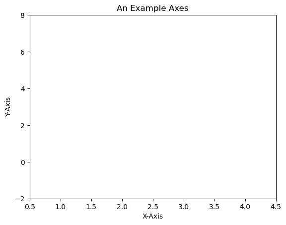
figure is a very powerful tool, giving us a very fine level of control over the appearance of the final figure. The Figure is the top-level container in the hierarchy of our plot. It is the overall window/page that everything is drawn on.
Most plotting ocurs on Axes. The axes are effectively the area that we plot data on and any ticks/labels/etc associated with it. You use subplots to set up and place your Axes on a regular grid.
We can set up a very basic figure as follows:
fig = plt.figure()
ax = fig.add_subplot(111) # We'll explain the "111" later. Basically, 1 row and 1 column.
ax.set(xlim=[0.5, 4.5], ylim=[-2, 8], title='An Example Axes',
       ylabel='Y-Axis', xlabel='X-Axis')
plt.show()
# executable code for the above
fig = plt.figure()
ax = fig.add_subplot(111) # We'll explain the "111" later. Basically, 1 row and 1 column.
ax.set(xlim=[0.5, 4.5], ylim=[-2, 8], title='An Example Axes',
       ylabel='Y-Axis', xlabel='X-Axis')
plt.show()
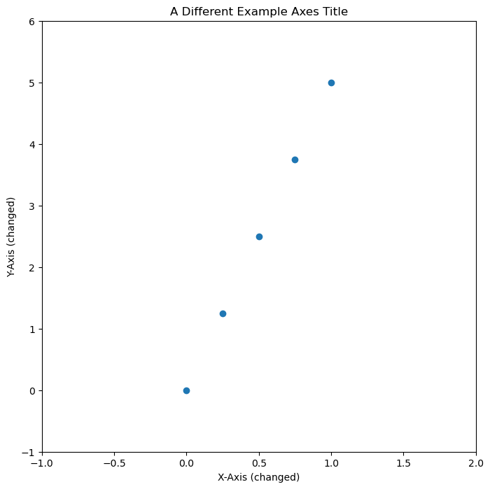
You can set up axes as follows, as it makes it easier to make changes things like axis lables. Note the addition of figsize=(8,8)- this allows us to adjust the size of the figure, in this case to 8x8 inches.
fig = plt.figure(figsize=(8,8))
ax = fig.add_subplot(111) # We'll explain the "111" later. Basically, 1 row and 1 column.
ax.set_xlim([0.5, 4.5])
ax.set_ylim([-2, 8])
ax.set_title('A Different Example Axes Title')
ax.set_ylabel('Y-Axis (changed)')
ax.set_xlabel('X-Axis (changed)')
ax.scatter(np.linspace(0, 1, 5), np.linspace(0, 5, 5))
plt.show()
We can also choose to save the figure, using the following, replacing format with the filetype we want to save our figure as.
fig.savefig('myplot.format')
You are able to save this figure in many different formats, including pdf, jpeg, png etc. You can find out the available formats using the command plt.gcf().canvas.get_supported_filetypes()
Note that your figure will be overwritten each time you run your script.
fig = plt.figure(figsize=(8,8))
ax = fig.add_subplot(111) # We'll explain the "111" later. Basically, 1 row and 1 column.
ax.set_xlim([-1, 2])
ax.set_ylim([-1, 6])
ax.set_title('A Different Example Axes Title')
ax.set_ylabel('Y-Axis (changed)')
ax.set_xlabel('X-Axis (changed)')
ax.scatter(np.linspace(0, 1, 5), np.linspace(0, 5, 5))
plt.show()
Exercise 3.4: putting this all together#
In this example, we’re going to generate some fake data, tweak the plot until we’re happy with it, then save the plot. An example code is given, but try editing this for your example. For example change the provided function to a different one!
Generate some fake data using a function of your choice. First, define an x-array of data, then generate a y-array of data e.g.
y(x). This could be something like e.g.y = x**3 + np.sin(x)Plot this data using the figure environment.
Adjust the plot axes, labels, colours etc. until you are happpy with them.
Save the figure in your chosen format.
If you generate a scatter plot, you can select a marker (point style) of your choice, using options on the following link:
https://matplotlib.org/api/markers_api.html
For example, if you want a scatter plot to use red hexagons, you can do the following, where s increases the size of the plot:
ax.scatter(x,y, marker="h", color='red' , s=20)
You’re free to generate whatever fake data you choose here, or you could use some of the data earlier. Feel free to customise your plot by choosing different colours, markers etc.