Histograms- Solved
Contents
import numpy as np
import matplotlib.pyplot as plt
Histograms- Solved#
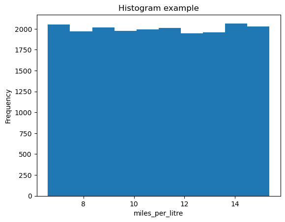
Let’s create a histogram of some data. We’ll compute the miles driven per litre of fuel, and make a histogram of the result. The histogram function is a little weird, so let’s try and illustrate this.
# Let's generate some fake data to work with.
#(don't worry yet about *how* this is generated!)
miles_driven = np.random.random(20000) * 90. + 10
litres_of_fuel_used = miles_driven / (10.977912440170378 * (np.random.random(20000) * 0.8 + 0.6))
# A basic histogram

# Compute what we want to histogram
miles_per_litre = miles_driven / litres_of_fuel_used

plt.hist(miles_per_litre)
plt.title('Histogram example')
plt.xlabel('miles_per_litre')
plt.ylabel('Frequency')
Text(0, 0.5, 'Frequency')
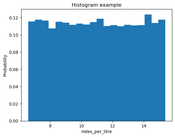
Let’s see what we can change in this histogram. Here we provide two key-word arguments to plt.hist. bins is an integer specifying the number of bins the data is split into, density can be used to normalize the plot so this becomes a probability. Using plt.hist? will tell you what these options are.
# A basic histogram again

# Compute what we want to histogram
miles_per_litre = miles_driven / litres_of_fuel_used

plt.hist(miles_per_litre, bins=20, density=True)
plt.title('Histogram example')
plt.xlabel('miles_per_litre')
plt.ylabel('Probability')
Text(0, 0.5, 'Probability')
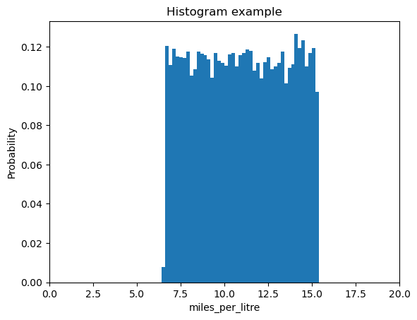
bins can also take an array of values:
# A basic histogram again
# Compute what we want to histogram
miles_per_litre = miles_driven / litres_of_fuel_used
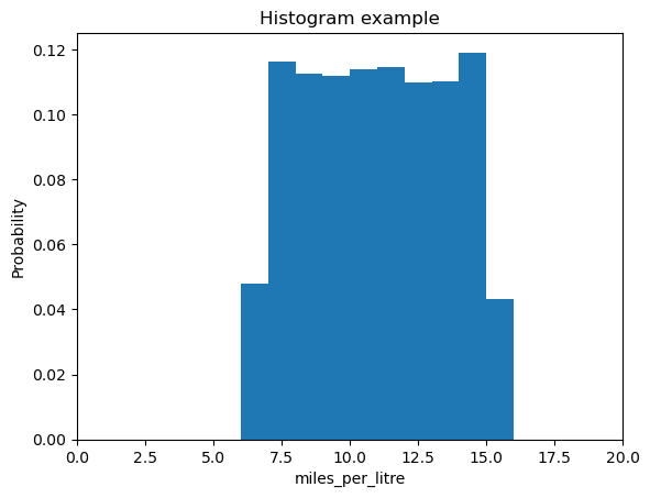
plt.hist(miles_per_litre, bins=np.arange(5,20,0.2), density=True)
plt.title('Histogram example')
plt.xlabel('miles_per_litre')
plt.xlim(0,20)
plt.ylabel('Probability')
Text(0, 0.5, 'Probability')
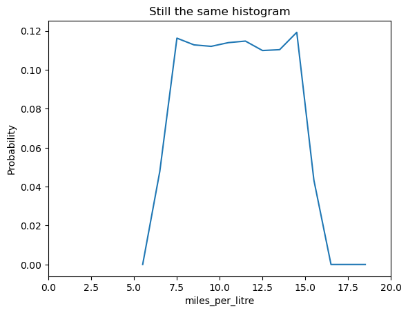
The plt.hist command also returns some useful information. It returns 3 values, n, bins and patches. We can ignore patches it’s an internal for the plotting and very rarely used. n is the probability (or frequency) of each of the bars used in the histogram, or the height of each bar. bins is the edge of each of the bars. The length of this will be one larger than n as each bar has two edges and all but the outer two are shared. If we use n and the center of each bar, we can also plot a line graph on top of this!
# A basic histogram again

# Compute what we want to histogram
miles_per_litre = miles_driven / litres_of_fuel_used

n, bins, patches = plt.hist(miles_per_litre, bins=np.arange(5,20,1), density=True)
# Want center of bins, this is done with:
bin_centers = (bins[:-1] + bins[1:]) / 2
# THINK ABOUT WHAT THE PREVIOUS LINE IS DOING, how does it work??
plt.title('Histogram example')
plt.xlabel('miles_per_litre')
plt.xlim(0,20)
plt.ylabel('Probability')

# Create a second! figure
plt.figure()
plt.plot(bin_centers, n)
plt.title('Still the same histogram')
plt.xlabel('miles_per_litre')
plt.xlim(0,20)
plt.ylabel('Probability')
plt.show()
Using histograms to explore data#
Let’s create a histogram of some exam results. In the code block below, results for two subjects are presented as a numpy array, along with student number. The first column of the array is the student identity, the second column is the result for subject 1, and the third column is the result for subject 2.
exam_results = np.array([[  1.        ,  70.73956466,  72.41314302],
       [  2.        ,  67.99148762,  78.92281229],
       [  3.        ,  63.267019  ,  73.70905389],
       [  4.        ,  80.92116686,  97.09605513],
       [  5.        ,  45.26067825,  51.29838892],
       [  6.        ,  47.82370635,  54.11048266],
       [  7.        ,  71.16827658,  80.03105428],
       [  8.        ,  69.53215499,  76.25594456],
       [  9.        ,  42.8598281 ,  62.61465786],
       [ 10.        ,  36.43916344,  45.82388885],
       [ 11.        ,  82.90174814,  84.32172436],
       [ 12.        ,  50.37521144,  65.6275095 ],
       [ 13.        ,  66.74455826,  75.83412285],
       [ 14.        ,  55.32285171,  63.10303691],
       [ 15.        ,  65.73495683,  75.81885856],
       [ 16.        ,  76.0219976 ,  85.5319897 ],
       [ 17.        ,  38.08746824,  54.64233231],
       [ 18.        ,  79.8372733 ,  93.00396844],
       [ 19.        ,  76.01442223,  96.46448714],
       [ 20.        ,  58.02985105,  64.75190419],
       [ 21.        ,  40.52704653,  60.47125425],
       [ 22.        ,  70.66882769,  84.71060747],
       [ 23.        ,  48.5342397 ,  58.02515169],
       [ 24.        ,  47.54020755,  47.62578148],
       [ 25.        ,  54.11323876,  67.97462115],
       [ 26.        ,  38.28093002,  42.79495584],
       [ 27.        ,  36.59503322,  48.69430327],
       [ 28.        ,  33.84867708,  44.43720282],
       [ 29.        ,  74.66290772,  90.18370617],
       [ 30.        ,  47.23836888,  59.73585737],
       [ 31.        ,  54.75012795,  68.87991986],
       [ 32.        ,  62.03758377,  71.84132858],
       [ 33.        ,  66.65167142,  79.90693845],
       [ 34.        ,  26.72953461,  36.69420763],
       [ 35.        ,  53.08619   ,  54.91571935],
       [ 36.        ,  47.21023846,  55.30553085],
       [ 37.        ,  66.02714831,  62.06656138],
       [ 38.        ,  75.20276983,  90.48009585],
       [ 39.        ,  63.2538258 ,  69.13807308],
       [ 40.        ,  51.56423263,  54.39883796],
       [ 41.        ,  64.91847439,  67.59731781],
       [ 42.        ,  46.95447299,  51.84797284],
       [ 43.        ,  47.77083436,  61.81327459],
       [ 44.        ,  59.69085344,  73.50586767],
       [ 45.        ,   8.17242208,  23.18407151],
       [ 46.        ,  34.62284483,  45.71480234],
       [ 47.        ,  52.8604269 ,  70.25417135],
       [ 48.        ,  51.74504612,  55.76399523],
       [ 49.        ,  54.50697994,  59.68155288],
       [ 50.        ,  82.48217025, 103.48154944],
       [ 51.        ,  60.28539761,  70.78967487],
       [ 52.        ,  58.54967699,  65.75231913],
       [ 53.        ,  77.17822098,  84.42547234],
       [ 54.        ,  78.31459855,  84.5724306 ],
       [ 55.        ,  38.34086535,  52.21166258],
       [ 56.        ,  67.35682844,  66.24734467],
       [ 57.        ,  64.97912032,  80.03917431],
       [ 58.        ,  65.72149585,  82.28469639],
       [ 59.        ,  36.53819421,  49.27764887],
       [ 60.        ,  86.43103191,  98.06981689],
       [ 61.        ,  45.95170777,  44.45078473],
       [ 62.        ,  79.2032959 ,  90.18129041],
       [ 63.        ,  51.19023925,  66.71286159],
       [ 64.        ,  32.26181842,  38.25816568],
       [ 65.        ,  53.24160216,  62.96163071],
       [ 66.        ,  62.43142538,  68.74879939],
       [ 67.        ,  44.46113729,  52.21153366],
       [ 68.        ,  60.92604303,  74.02768794],
       [ 69.        ,  38.15081469,  51.38430159],
       [ 70.        ,  29.26667822,  39.27582798],
       [ 71.        ,  50.9334228 ,  60.28670523],
       [ 72.        ,  56.29361108,  70.43569258],
       [ 73.        ,  38.64293222,  57.52761187],
       [ 74.        ,  56.6881452 ,  72.12088168],
       [ 75.        ,  40.695333  ,  60.47617002],
       [ 76.        ,  55.75334792,  66.07146542],
       [ 77.        ,  47.75259096,  47.68539031],
       [ 78.        ,  75.0085495 ,  83.17227103],
       [ 79.        ,  62.2028212 ,  71.23363559],
       [ 80.        ,  43.75410011,  60.51900205],
       [ 81.        ,  35.18835159,  45.02149959],
       [ 82.        ,  59.983474  ,  70.15753838],
       [ 83.        ,  51.00087488,  55.96757473],
       [ 84.        ,  64.54303038,  68.55737492],
       [ 85.        ,  38.22527241,  49.40639262],
       [ 86.        ,  58.96817727,  59.56603956],
       [ 87.        ,  56.39589119,  66.8567686 ],
       [ 88.        ,  37.05702865,  48.43399149],
       [ 89.        ,  41.516083  ,  58.50291861],
       [ 90.        ,  54.31904919,  64.40041264],
       [ 91.        ,  46.04248627,  49.25228526],
       [ 92.        ,  55.23428729,  61.04316797],
       [ 93.        ,  45.89224131,  48.19227671],
       [ 94.        ,  65.82101245,  69.61489965],
       [ 95.        ,  61.96416517,  77.11649529],
       [ 96.        ,  67.39839128,  70.62675872],
       [ 97.        ,  56.3951805 ,  68.94576081],
       [ 98.        ,  21.06575367,  37.1626017 ],
       [ 99.        ,  69.86085469,  61.02910376],
       [100.        ,  35.8927636 ,  42.94057985]])
Exercise 3.1#
Let’s explore this data using some numpy functions and histograms. You will need to slice the array to access the required columns.
Create an array
subject_onecontaining the results presented in column 2 of the arrayCreate a second array
subject_twocontaining the results presented in column 3 of the arrayCalculate the mean and standard deviation for each of these subjects. You can write your own functions or use inbuilt functions for this purpose.
print(type(exam_results))

subject_one = exam_results[:,1]

subject_two = exam_results[:,2]

print(np.mean(subject_one),np.mean(subject_two))
print(np.std(subject_one),np.std(subject_two))
<class 'numpy.ndarray'>
54.88590124979998 64.5670703655
15.009846375162516 15.394606968167492
for line in subject_one:
  if line > 50:
    print(line)
70.73956466
67.99148762
63.267019
80.92116686
71.16827658
69.53215499
82.90174814
50.37521144
66.74455826
55.32285171
65.73495683
76.0219976
79.8372733
76.01442223
58.02985105
70.66882769
54.11323876
74.66290772
54.75012795
62.03758377
66.65167142
53.08619
66.02714831
75.20276983
63.2538258
51.56423263
64.91847439
59.69085344
52.8604269
51.74504612
54.50697994
82.48217025
60.28539761
58.54967699
77.17822098
78.31459855
67.35682844
64.97912032
65.72149585
86.43103191
79.2032959
51.19023925
53.24160216
62.43142538
60.92604303
50.9334228
56.29361108
56.6881452
55.75334792
75.0085495
62.2028212
59.983474
51.00087488
64.54303038
58.96817727
56.39589119
54.31904919
55.23428729
65.82101245
61.96416517
67.39839128
56.3951805
69.86085469
high_marks = (subject_one > 70)
print(subject_one[high_marks])
[70.73956466 80.92116686 71.16827658 82.90174814 76.0219976  79.8372733
 76.01442223 70.66882769 74.66290772 75.20276983 82.48217025 77.17822098
 78.31459855 86.43103191 79.2032959  75.0085495 ]
Exercise 3.2#
Let’s visualise these results using the data visualisation techniques we have explored so far.
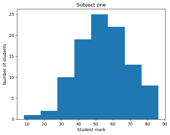
Plot a histogram showing the results for subject 1.
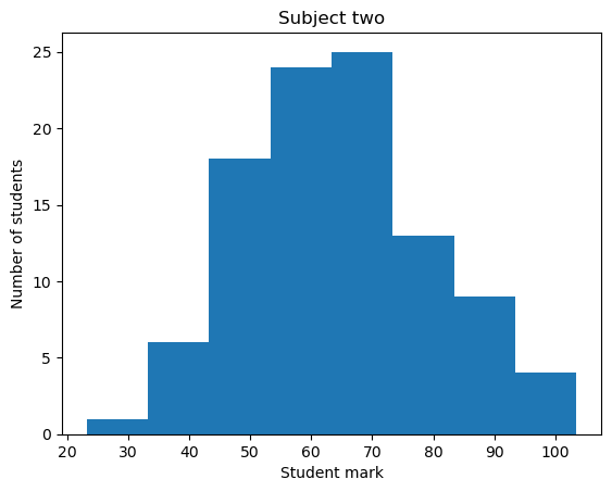
Plot a histogram showing the results for subject 2.
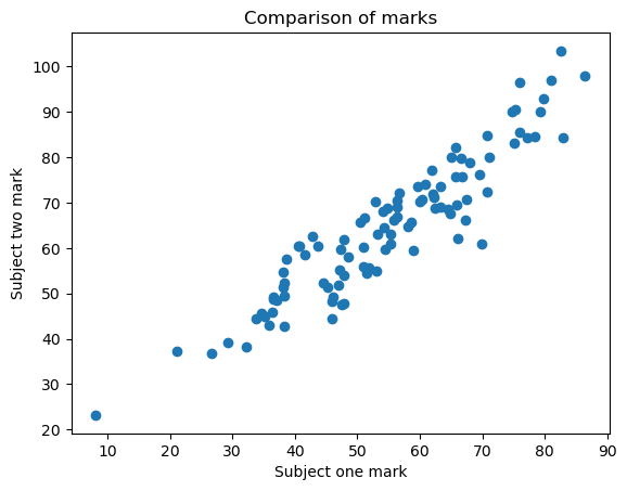
Plot a scatter plot of subject 1 versus subject 2.
Save each of these plots using the command
plt.savefig('filename.png').
plt.hist(subject_one, bins=8)
plt.title('Subject one')
plt.xlabel('Student mark')
plt.ylabel('Number of students')
plt.savefig("Results_subject_one.png")
plt.show()

plt.hist(subject_two, bins=8)
plt.title('Subject two')
plt.xlabel('Student mark')
plt.ylabel('Number of students')
plt.savefig("Results_subject_two.png")
plt.show()

plt.scatter(subject_one, subject_two)
plt.title('Comparison of marks')
plt.xlabel('Subject one mark')
plt.ylabel('Subject two mark')
plt.savefig("Results_compare.png")
plt.show()
Exercise 3.3#
You may have noticed that some of the exam results are over 100. Given these results are percentages, these results need to be flagged.
Write a function that takes the exam results array as an input, and returns the student ID and subject for any incorrect marks. You can write this function using a numerical method of your choice (i.e. we don’t mind how you code this, use a method that makes sense to you).
def func_flagres(inarray):
  for line in inarray:
    if (line[1] > 100):
      return(line[0],"Subject 1")
    elif (line[2] > 100):
      return(line[0],"Subject 2")
    else:
      continue

res = func_flagres(exam_results)
print(res)
(50.0, 'Subject 2')
myflag = ((exam_results[:,1] > 100) | (exam_results[:,2] > 100))
print(exam_results[:,0][myflag])
[50.]
def func_flagres(inarray, filter=100, number_subj = 2):
    outputs = []
    for subject in range(1, number_subj +1):
        subject_arr = exam_results[exam_results[:,subject]>filter]
        output1 = subject_arr[:, 0]
        output1_sub = np.full(output1.size, f"Subject {subject}")
        output = np.array([output1, output1_sub])
        outputs.append(output)
    return np.concatenate(outputs, axis=1).transpose()
def func_flagres(inarray):
    filter = 100
    subject1_arr = exam_results[exam_results[:,1]>filter]
    output1 = subject1_arr[:, 0]
    output1_sub = np.full(output1.size, "Subject 1")
    output1_full = np.array([output1, output1_sub])
    subject2_arr = exam_results[exam_results[:,2]>filter]
    output2 = subject2_arr[:, 0]
    output2_sub = np.full(output2.size, "Subject 2")
    output2_full = np.array([output2, output2_sub])
    return np.concatenate([output1_full, output2_full], axis=1).transpose()
res = func_flagres(exam_results)
print(res)
[['50.0' 'Subject 2']]
The figure environment#
So far, we have mainly made use of the plt command to make simple plots. This is a very quick, convenient method of plotting, but doesn’t always produce the nicest looking results.
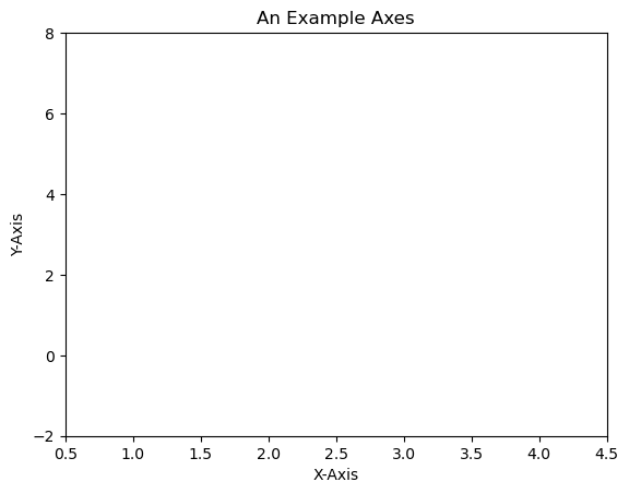
figure is a very powerful tool, giving us a very fine level of control over the appearance of the final figure. The Figure is the top-level container in the hierarchy of our plot. It is the overall window/page that everything is drawn on.
Most plotting ocurs on Axes. The axes are effectively the area that we plot data on and any ticks/labels/etc associated with it. You use subplots to set up and place your Axes on a regular grid.
We can set up a very basic figure as follows:
fig = plt.figure()
ax = fig.add_subplot(111) # We'll explain the "111" later. Basically, 1 row and 1 column.
ax.set(xlim=[0.5, 4.5], ylim=[-2, 8], title='An Example Axes',
       ylabel='Y-Axis', xlabel='X-Axis')
plt.show()
fig = plt.figure()
ax = fig.add_subplot(111) # We'll explain the "111" later. Basically, 1 row and 1 column.
ax.set(xlim=[0.5, 4.5], ylim=[-2, 8], title='An Example Axes',
       ylabel='Y-Axis', xlabel='X-Axis')
plt.show()
You can set up axes as follows, as it makes it easier to make changes things like axis lables. Note the addition of figsize=(8,8)- this allows us to adjust the size of the figure, in this case to 8x8 inches.
fig = plt.figure(figsize=(8,8))
ax = fig.add_subplot(111) # We'll explain the "111" later. Basically, 1 row and 1 column.
ax.set_xlim([0.5, 4.5])
ax.set_ylim([-2, 8])
ax.set_title('A Different Example Axes Title')
ax.set_ylabel('Y-Axis (changed)')
ax.set_xlabel('X-Axis (changed)')
ax.scatter(np.linspace(0, 1, 5), np.linspace(0, 5, 5))
plt.show()
We can also choose to save the figure, using the following, replacing format with the filetype we want to save our figure as.
fig.savefig('myplot.format')
You are able to save this figure in many different formats, including pdf, jpeg, png etc. You can find out the available formats using the command plt.gcf().canvas.get_supported_filetypes()
Note that your figure will be overwritten each time you run your script.
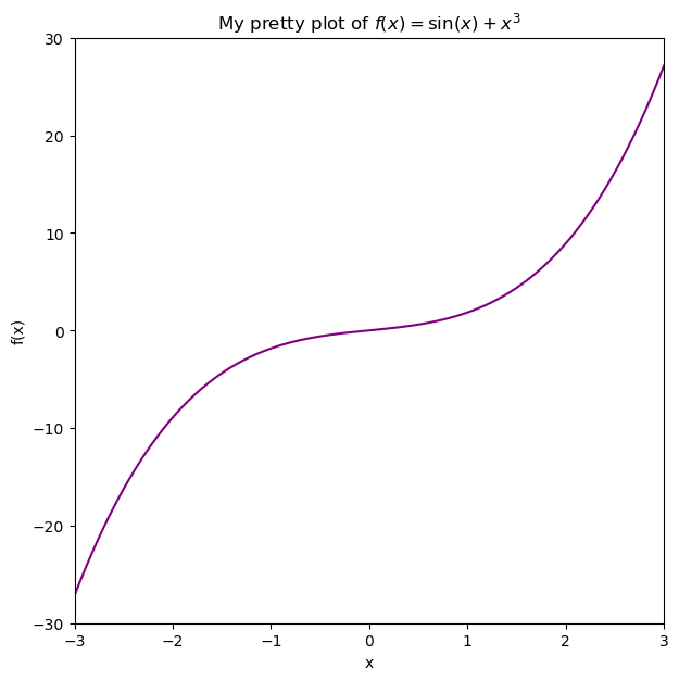
Exercise 3.4: putting this all together#
In this example, we’re going to generate some fake data, tweak the plot until we’re happy with it, then save the plot. An example code is given, but try editing this for your example. For example change the provided function to a different one!
Generate some fake data using a function of your choice. First, define an x-array of data, then generate a y-array of data e.g.
y(x). This could be something like e.g.y = x**3 + np.sin(x)Plot this data using the figure environment.
Adjust the plot axes, labels, colours etc. until you are happpy with them.
Save the figure in your chosen format.
If you generate a scatter plot, you can select a marker (point style) of your choice, using options on the following link:
https://matplotlib.org/api/markers_api.html
For example, if you want a scatter plot to use red hexagons, you can do the following, where s increases the size of the plot:
ax.scatter(x,y, marker="h", color='red' , s=20)
You’re free to generate whatever fake data you choose here, or you could use some of the data earlier. Feel free to customise your plot by choosing different colours, markers etc.
x = np.linspace(-3,3,100)
y = np.sin(x) + x**3

fig = plt.figure(figsize=(7,7))
ax = fig.add_subplot(111) # We'll explain the "111" later. Basically, 1 row and 1 column.
ax.set(xlim=[-3,3], ylim=[-30., 30], title='My pretty plot of $f(x) = \sin(x) + x^{3}$',
       ylabel='f(x)', xlabel='x')
ax.plot(x,y, color="purple")
plt.show()